Do you ever catch yourself scrolling through Instagram and you find this post that looks really great so you get pulled to the creators profile. You see that their profile looks really cohesive and well put together and you think to yourself, “man, I wish my profile looked this good.” Well my friend, it can!
What is the main thing that attracts you to someone’s post or profile? Some type of imagery right? It might be a photo or maybe it’s a graphic, either way, we are visual beings. We are attracted to things that look good.
If you find yourself lost on Canva, or using the same templates as everyone else on Instagram, and you want to stand out from the crowd, maybe it’s time to invest in custom Instagram templates. When you find a graphic designer who specializes in custom Instagram templates, like me, they will create a specific set of templates made just for you. They will fit your branding and your message and will help you look great on the gram.
So why should you invest in custom Instagram templates? Here are four reasons you should highly consider it.
Creates a Cohesive Look to Your Profile
Like I mentioned before, a cohesive profile looks good and attracts viewers and followers, which can also lead to clients. Plus, when your profile looks good, you feel good.
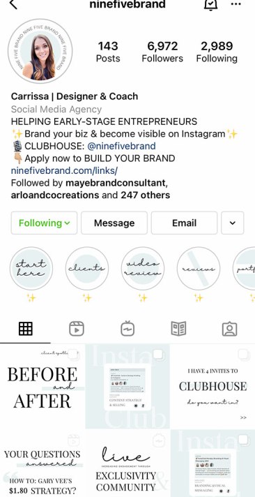
So what all goes into a cohesive look? It’s all about using your brands colors, fonts, and themes. Like when you look at my profile for instance, you will see the same repeated colors and tones. You won’t see a lime green or hot pink, because that’s not a part of my branding. My branding may be fun, but it’s not that fun. It’s more toned down and subtle, with pops of color that aren’t too vibrant, but just bright enough.
You will also notice the same couple of fonts used repeatedly. This helps to bring in my branding and make everything cohesive and not too crazy and chaotic for the viewer.
A good rule of thumb in graphic design and branding is to stick to 2-3 fonts. Typically a sans serif for body copy and a fun decorative or script font to toss in here and there for headings and other things.
Same goes for colors, though those you can typically have 3-5. It’s good to have a light and a dark for contrast and then a good pop of color for some added fun.
Using these elements will help to create a cohesive look not only throughout your branding, but also your Instagram feed.
Increase Brand Awareness
This ties in with the cohesive branding. When you use the same colors and fonts repeatedly, you become known for it by your viewers. Which means when they are scrolling through Instagram and spot those specific colors, they will know it’s you.
For instance, when I’m scrolling through Instagram and I come across a white post with hints of mint and a bold serif and playful script font, I know that it’s a post by Nine Five Brand. Carrissa Myers has created a beautiful, eye-catching brand that is so recognizable and all its own, and you can do that too. With the right help, you can have a scroll-stopping graphic that catches the eyes of your followers and gets them to engage with your post.

Photo courtesy of Carrissa Myers, @ninefivebrand on Instagram.
Saves You Time
One of my favorite reasons for having and promoting custom Instagram templates is the pure fact that they save you so much time when you’re creating content. Not a lot of people like creating content, and when it comes to the graphic, some people just throw something together that isn’t very eye catching or use the same templates that everyone else is using.
Don’t get me wrong, Canva has some great templates, but you have to tweak them and make them your own. I like to use them as a starting point sometimes, and then customize them to be something completely new. And I’m not talking about just changing up the colors and fonts to fit my branding, I’m talking about removing some elements, moving things around and really changing them up so that they look completely different from what I had to start with.
With custom Instagram templates, they are already done for you and you know that no one else has a template that looks like that, or not likely. It is one-of-a-kind and all your own. When it comes to creating your content, all you have to do is select which one you want to use, drop in the new text and swap out the photo, maybe switch up the colors and you’re done. It can take you all of five minutes when it probably took you close to 30 minutes or longer before.
Supporting a Fellow Entrepreneur
Another great reason for investing in custom templates is the fact that you will be supporting a fellow entrepreneur. Working together and helping one another out is all part of the fun.
I love the women I get to work with and help to create graphics for and I enjoy what I do. I love setting up a quick call to understand their brand and hear them talk about it in their own words. After the call I get to dive in and really get creative and have fun! I have worked with women in all kinds of industries and it’s always something new.
So if you are on the ropes about investing in custom templates, I hope this article helps you to see how they can help your business. If you are interested or maybe have a few questions, feel free to contact me. I’m always happy to talk about design and I’m happy to answer any questions you might have about the service.