We all know that Instagram is the Queen of social media platforms. Some might argue, but which platform do you spend most of your time on? If you’re anything like me, it’s Instagram.
Instagram is great for so many reasons! You can:
- Get inspiration from other artists and people in your industry
- Find helpful tips from industry experts
- Purchase prints and stickers from cute Etsy shops
- Find amazing mentors
- Connect with awesome like-minded people
- Sell products and services
And honestly, that’s just the tip of the iceberg.
But when it comes to your business profile and your own feed, you want it to look legit. If you are selling products or services, you need to have a brand in place as well as a brand strategy and content marketing strategy. These are all pieces that you might not think of right away, but are very important to your business’s Instagram profile, and here’s why.
To have a kick ass business profile you need to make sure that you have a consistent image and brand style. This way, when people are scrolling mindlessly through their Instagram feed, they see your post and automatically know that it’s you. This helps you to stand out and become recognizable to your followers.
So how do you get this great design aesthetic to your Instagram profile? Here are 8 super helpful tips for designing graphics for Instagram.
Use Brand Colors
One of the most important elements of any business is your brand colors. Make sure that you use those, and almost exclusively those, with your Instagram graphics. You should have about 4-5 brand colors, with one color being a bold accent color to toss in for a little extra somethin’ something’ from time to time. Now and then it is okay to stray away a little with slightly different hues if you are going for something a little different, but staying true to your brand colors is key. This helps to make your Instagram feed look professional and well put together.
Stick to your Brand Fonts
Brand fonts are just as important as brand colors. They help to distinguish your brand. You don’t want to have a bunch of random fonts all over your feed. This doesn’t look very professional and can quickly turn people away from your profile.
Some might argue that people don’t always go to your profile, they just see your individual posts. However, at some point, someone is going to go to your profile page and you want it to look good. You want it to look so good that they follow you and maybe even slide into your DM’s because they want to work with you. If your profile doesn’t look professional or well put together, they will hit that back button and be on their way to someone else and forget all about you.
Use Consistent Design Elements
Having similar elements that you stick to helps to further elevate your graphics. When I talk about elements I’m loosely referring to shapes or illustrations and other types of extra funness you might add to a graphic. With my designs I try to stick to circles and organic shapes. This is further expanded by a variation of my logo which is in the shape of a circle. Using similar elements helps to make your designs look cohesive and makes designing easier on you.
Consider Your Feed Layout
I know there are some people who don’t like feed layouts and others who swear by it, I’m somewhere in the middle. I know that if a feed layout is done well on someone’s feed that I am looking at, I am more likely to follow them because in my head, they look composed and professional. I personally don’t really have a layout to my feed, but I definitely have select styles and templates that I tend to stick to.
Feed layouts are a great option for people who like a clean, put together look. You can do everything from a simple checkerboard feed to something that looks a little bit more organic like an every 4th or 5th post, or go all out with a puzzle feed. There are a ton of different options out there and they can all look fun and unique to each individual feed.
Use the Right Size for Instagram
This can depend on the style of your feed, but something to keep in mind is the sizing of your graphics. What size do Instagram graphics need to be? There are two main types of Instagram posts, the square and the portrait. A square post is 1080 pixels by 1080 pixels, while the portrait sizing is 1080 pixels by 1350 pixels. The portrait style is a great way to take up more space on someone’s screen and really pack a punch. However, on your profile feed it will still show up as a square.


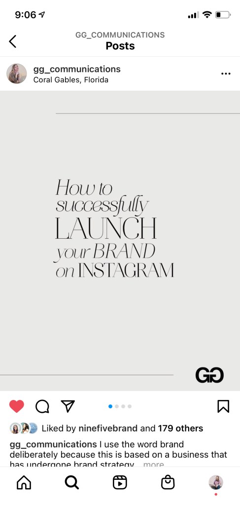
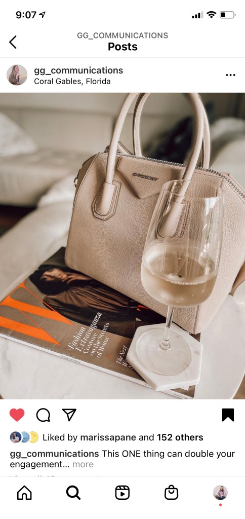
Photos courtesy of GG of @gg_communications on Instagram.
Have Go-To Templates
One way to elevate your feed is by having consistent templates. As I mentioned before, I don’t really have a feed layout, but I do have templates that I tend to reuse to help my profile feed to look consistent. This also helps so that when people see my posts while scrolling in their feed, they know it’s me. Having custom templates is a great way to make designing easier for you, especially if you are not a designer by trade.
Canva is great because it has a ton of templates to choose from. However, as a graphic designer, I strongly suggest using them as inspiration and tweaking them to work for you. I don’t just mean changing the colors and the fonts, I mean, making it unique to you. This is another way to help you stand out on Instagram. If you use the same Canva template as your competitor Sally, with the same colors and everything, and someone follows both you and Sally, they might look right over you thinking they already saw that post. Be unique and stand out! Change it up and add your own flare to the templates to make them your own so that you can stand out.
Stay Consistent Throughout Everything on Instagram
If you have taken anything away from this blog, I hope that it’s consistent. Staying consistent with your design is important to elevate your brand. While you definitely need to make sure that your feed is on brand graphic-wise, you can also make your stories branded. Using the same colors and fonts there makes everything super cohesive and professional looking. While you can’t use your exact branded fonts, you can choose fonts provided by Instagram that are similar to them or ones that go well with your brand aesthetic.
You can also take it one step further and create covers for your Instagram Reels so that they also look cohesive to your brand. Covers for Reels only show up on your Instagram profile, so it’s up to you if you want to make a custom cover or not. I highly suggest that if you decide to add your Reels to your actual feed you do create a cover so that you continue to have a cohesive style on your feed. This just helps to not throw anything off and keep everything consistent.
Not sure how to use your brand colors on Instagram stories? I made a super helpful Reel that can show you exactly how to do it! It’s super simple and fun to do.
Canva is Your Best Friend
Canva is a great tool for non-designers and designers alike. Everything from their templates to their brand kit tool sets you up for success. They have so many great features for you to utilize and create awesome graphics that attract people’s attention and gain you followers. Not to mention, they make it easy for you to stay consistent with your design and keep things looking professional.
Want more great insider tips on how to use Canva for your business? Download my Free Canva For Business Guide!
For more super helpful tips on graphic design and using Canva for success, follow me on Instagram @rhiannonraedesigns!